What a great color combo; I once again created two cards - opposite ends of the spectrum - CAS (clean and simple) and vintage!
The first card is so simple and uses a stencil as you see Kathy Racoosin do all the time for that last finishing touch...and lots of white gel details! The rose is from MFT; I cut it from the top panel, and added a sponged distress panel beneath after sprinkling with water and spraying with shimmer mist. I stamped the sentiments, outlined the left side of the 'wishes' with a gray Copic and finished it off with this super fun stencil and Broken China distress ink. My kraft is some hemp tied into a small bow; I finished the inside off with more washi tape!
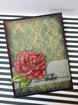
For my next card, I went vintage. Have you seen this video by Gina K? I was so inspired! I stamped the flower on PTI kraft card stock and colored with Prismacolor pencils - whew - talk about a learning curve, but it was fun!! One I was happy with the details, I outlined the image with a Sharpie then fussy cut it out. I popped it up with dimensional tape and added it to the strip of embossed vellum with this delicate sentiment. The background was created just as you see Gina K do; I 'swiped' on Old Paper, Pumice Stone and Broken China. Once the main panel was done I added more Pumice Stone and Black Soot to the edges, then distressed the panel. I added a layer of red and distressed it too.
That's it; hope you'll join the fun, we love seeing what you create!

WHAT'S IT TAKE?
Stamps: WPlus9 That is All, Impression Obsession Open Rose, Gina K Scripty Sayings
Papers: Neenah 80 lb. and 110 lb. PTI True Black, Kraft, SU Real Red, vellum
Ink: Various distress inks, Hero Arts black, MFT Red Hot, VersaFine
Accessories: Hero Arts clear embossing powder, Prismacolor Pencils, Butterscotch Dimensional Pearls, hemp, Hero Arts stencil, clear Wink of Stella, Heidi Swapp distressorPapers: Neenah 80 lb. and 110 lb. PTI True Black, Kraft, SU Real Red, vellum
Ink: Various distress inks, Hero Arts black, MFT Red Hot, VersaFine
Challenges:
JUGS - color theme
The Flower Challenge
The Card Concept - Shabby/Chic Vintage


Two more beauties! You are making JUGs look so good!
ReplyDeleteLove both flowers! The inlaid so pretty with the bg, and the colored one is gorgeous too
ReplyDeleteLove both of these, Michele. The background on the second one is so great, I have GOT to try that technique. Need to go back and watch Gina do it again. Your cards are lovely!
ReplyDeleteYou're putting us to shame making two cards for every challenge, Michele. I love the coloring and background on your vintage card. I watched the video and will be trying that technique.
ReplyDeleteYou are really doing an amazing job with us at JUGS! Both of these cards are fabulous, however the vintage one is a real show stopper! Well done!
ReplyDeleteYou've done it again with these 2 beautiful but so different styled cards. Love them both. Stunning!
ReplyDeleteBoth are beautiful in different ways! The first one is a great CASE of Therese's card! The inlaid pretty red rose on the subtle background looks so cheerful! Thanks for joining us at The Flower Challenge!
ReplyDeleteBeautiful card Michelle, love the flower die you used and the layout looks wonderful. Thank you so much for joining us at the flower Challenge Aileen DT
ReplyDeleteLove the bright colours of this rose, it totally makes a bold statement and those added dots were genius!
ReplyDeleteI love the bright roses against the soft backgrounds. Great cards! Thanks so much for joining us this week at The Card Concept.
ReplyDeleteBoth of these cards are great! I just love the flowers you used. You did an awesome job coloring that second rose. Thank you for sharing! I would love to share my projects with you. I am always looking for tip, techniques and comments from fellow crafters. If you would like to take a look - TheCraftyCritter.com
ReplyDelete-Miranda
I love how you've created two such different cards - one really modern and the other vintage. The background looks fab on the second..must try that tutorial!
ReplyDelete